This piece starts from one of the most copied graphic designs in the world: the “I love NY” logo, built around a red heart, that Milton Glaser drew in 1977 for New York State’s tourism campaign. Glaser designed it for free. The logo quickly outgrew the campaign and became a universal shorthand for the city itself, and even for a sense of belonging.
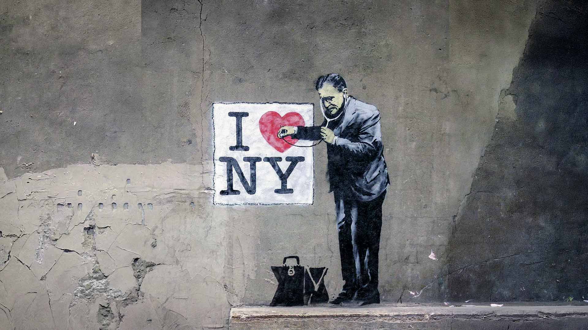
Banksy’s intervention on this logo follows one of his favourite moves: taking an image everyone knows by heart and inserting a figure that does not belong in it. Here, a doctor, a medical worker, steps in next to the logo. A slogan designed as a declaration of love suddenly turns into a scene of examination, a moment of diagnosis.
The meaning is built exactly in this shift. The symbol of love for the city suddenly looks like something in need of care. The heart is no longer only a feeling. It is an organ that needs to be checked, monitored, perhaps treated. In one image Banksy brings together how urban identity is packaged and sold, and the anxiety underneath that identity, expressed through the modern language of control built around security and health.
This reading is part of a question the artist has repeated throughout his career: what is the difference between loving a city and consuming it? How much of real street life does a tourist slogan actually see, and how much does it ignore? The doctor figure sharpens this question further, because his presence turns love into a matter of health, a matter of institutional responsibility.
This piece is a clean example of the technique known as detournement: turning an existing visual language into its own weapon. Adding a single figure to the logo is enough, and an expression of love that had always looked innocent suddenly starts to carry its own irony.